Remote UI Designer Jobs: Complete 2026 Career Guide
Everything you need to land a remote UI designer job. Visual design, design systems, interfaces - salary data, interview questions, and companies hiring.
Updated January 20, 2026 • Verified current for 2026
Remote UI designers create the visual layer of digital products - the colors, typography, icons, spacing, and interactive elements that users see and interact with daily. With salaries ranging from $55,000 to $160,000 for US-based remote positions (and up to $220,000 for lead roles), UI design offers a compelling career path for visually-minded professionals who want location flexibility. Unlike UX designers who focus on user research and information architecture, UI designers specialize in visual excellence: creating beautiful, consistent, and accessible interfaces that bring wireframes to life. Remote UI designers must excel at async collaboration through tools like Figma, where real-time design system work and visual feedback happen across time zones. The role rewards those with strong aesthetic sensibilities, meticulous attention to detail, and the ability to create design systems that scale across products. Success requires a portfolio showcasing visual craftsmanship, typography expertise, and systematic thinking about component-based design.
What Do Remote UI Designers Actually Do?
UI designers are the visual architects of digital products. While user experience designers determine how a product works, UI designers determine how it looks and feels. In remote environments, this visual craftsmanship translates into meticulous Figma work, design system creation, and async collaboration that spans continents.
Day-to-Day Responsibilities
Visual interface design: The core of UI design work involves creating high-fidelity mockups for web and mobile applications. You’ll receive wireframes or low-fidelity designs from UX designers (or create them yourself in hybrid roles) and transform them into polished, production-ready interfaces. This includes selecting colors, defining typography, designing icons, creating illustrations, and ensuring visual consistency across every screen.
Design system creation and maintenance: Modern UI design increasingly centers on design systems - libraries of reusable components, styles, and patterns. Remote UI designers spend significant time creating buttons, form elements, cards, navigation patterns, and other components that can be assembled into interfaces. Design systems enable consistency across products and faster design-to-development handoffs.
Typography and color work: UI designers make critical decisions about typefaces, font sizes, line heights, and color palettes. These choices affect readability, accessibility, brand perception, and user experience. You’ll create type scales, establish color systems with proper contrast ratios, and ensure visual hierarchy guides users through interfaces.
Responsive design: Every interface must work across screen sizes - from mobile phones to desktop monitors. UI designers create responsive layouts that adapt gracefully, ensuring the visual experience remains excellent regardless of device.
Prototyping and interaction design: While some companies have dedicated interaction designers, UI designers often prototype micro-interactions, hover states, transitions, and animations. These details elevate interfaces from functional to delightful.
Developer collaboration: Remote UI designers work closely with frontend engineers, providing design specifications, answering questions, and ensuring implementations match designs. This async collaboration through Figma comments, Loom videos, and documentation is crucial for remote success.
Design feedback and critique: You’ll participate in design reviews, providing and receiving feedback on visual work. In remote teams, this happens through structured async processes - recorded walkthroughs, written critiques, and virtual design sessions.
UI Designer vs UX Designer vs Product Designer
Understanding how UI design differs from related roles helps you position yourself correctly and target the right opportunities.
UI Designer: Focuses on visual design - how interfaces look. Core skills include typography, color theory, visual hierarchy, iconography, and design systems. Deliverables are high-fidelity mockups, component libraries, and visual specifications. UI designers may not conduct user research or create wireframes (though some do).
UX Designer: Focuses on user experience - how products work. Core skills include user research, information architecture, wireframing, usability testing, and journey mapping. Deliverables are research findings, wireframes, user flows, and prototypes. UX designers may not do visual design (though many can).
Product Designer: Combines UX and UI into an end-to-end role. Product designers own features from research through visual design, working as generalists who can handle the full design process. This is the most common design role at tech companies.
When companies hire UI Designers specifically: They typically want visual specialists who excel at the craft of visual design. These roles exist at larger companies with dedicated design teams, agencies with specialized roles, and companies with strong brand/visual identity needs.
Visual Excellence in Remote Environments
Remote UI design presents unique opportunities and challenges for visual work.
Advantages of remote UI design:
- Deep focus time for meticulous visual work without office interruptions
- Access to global design communities and inspiration
- Flexibility to work during your most creative hours
- Exposure to diverse design perspectives across cultures
- Often better compensation through access to higher-paying markets
Challenges to navigate:
- Async feedback on visual work requires clear communication
- Color calibration across monitors can vary (establish standards)
- Real-time collaborative design sessions require scheduling across time zones
- Building design intuition with teammates takes more intentional effort
- Presenting visual work effectively through video calls is a learned skill
Keys to remote UI design success:
- Master Figma’s collaboration features completely
- Develop exceptional written communication for design rationale
- Create self-documenting designs with clear annotations
- Record Loom walkthroughs explaining visual decisions
- Build relationships with engineers to ensure implementation quality
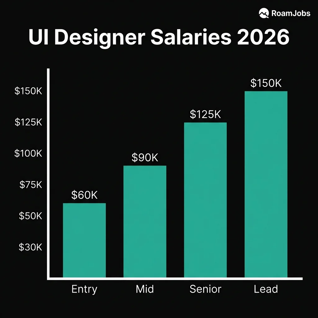
Salary Breakdown by Seniority Level
UI designer compensation varies significantly based on experience, skills, and the companies you work for. These figures represent remote positions with US-based companies - international designers often earn different rates depending on company compensation philosophy.
UI Designer Salary by Experience & Location
| Level | 🇺🇸 US Remote | 🇪🇺 EU Remote | 🌎 LATAM | 🌏 Asia |
|---|---|---|---|---|
| Entry Level (0-2 yrs) | $55,000 - $78,000 | $38,000 - $58,000 | $18,000 - $38,000 | $15,000 - $32,000 |
| Mid-Level (2-5 yrs) | $82,000 - $115,000 | $55,000 - $82,000 | $35,000 - $62,000 | $28,000 - $55,000 |
| Senior (5-8 yrs) | $115,000 - $160,000 | $78,000 - $120,000 | $55,000 - $95,000 | $45,000 - $85,000 |
| Lead/Director (8+ yrs) | $150,000 - $220,000 | $105,000 - $165,000 | $75,000 - $140,000 | $65,000 - $125,000 |
* Salaries represent base compensation for remote positions. Actual compensation may vary based on company, experience, and specific location within region.
Factors That Influence UI Designer Compensation
Visual design excellence: The quality of your portfolio directly impacts compensation. Designers with exceptional aesthetic sensibilities, strong typography skills, and polished execution command premium salaries.
Design system expertise: Companies building or maintaining design systems pay premiums for designers who understand component architecture, design tokens, and systematic design approaches.
Industry and company type: Design-focused companies (Figma, Canva, Webflow) often pay more than companies where design is a supporting function. Tech companies generally pay better than agencies or enterprises.
Technical knowledge: UI designers who understand CSS, frontend frameworks, or can work with design tokens in code earn more than purely visual designers.
Brand and marketing design: Skills in brand design, illustration, or motion graphics expand your value and earning potential, especially at smaller companies needing versatile designers.
Career Levels Deep Dive
Entry Level / Junior UI Designer
0-2 years experience
What Entry-Level UI Designers Do
As a junior UI designer, you’ll execute visual designs under guidance from senior designers. Your work focuses on creating interface screens from wireframes, maintaining design consistency, and learning the team’s design system. You’ll receive more direction than you give, but there’s significant opportunity to develop your craft.
Typical responsibilities:
- Create high-fidelity mockups from wireframes or specifications
- Design individual screens and components within existing systems
- Maintain visual consistency across product areas
- Update and extend existing design system components
- Participate in design critiques and feedback sessions
- Collaborate with developers on implementation details
Skills to Develop
Visual design fundamentals: Master typography (type scales, pairing, hierarchy), color theory (harmony, contrast, accessibility), layout (grid systems, spacing, alignment), and visual hierarchy (guiding user attention through design).
Figma proficiency: Become fluent in Figma - components, variants, auto-layout, constraints, prototyping, and collaboration features. This is your primary tool and differentiator.
Design system literacy: Understand how to work within existing design systems. Learn to use components correctly, follow established patterns, and contribute to system evolution.
Basic accessibility: Learn WCAG color contrast requirements, touch target sizes, and accessible typography. Accessibility is foundational, not an afterthought.
Communication skills: Practice articulating design decisions clearly. In remote work, your ability to explain “why” matters as much as the design itself.
Portfolio Focus for Entry Level
Your portfolio should demonstrate strong visual foundations even without professional experience.
What to include:
- 3-4 detailed case studies showing visual design process
- Redesign projects improving existing apps/websites
- Speculative projects demonstrating aesthetic range
- Evidence of systematic thinking (component libraries, style guides)
- Clear explanation of design decisions and visual rationale
What employers look for:
- Strong aesthetic sensibility and attention to detail
- Understanding of typography and color fundamentals
- Ability to create consistent, polished interfaces
- Growth mindset and coachability
- Enthusiasm for the craft of visual design
Mid-Level UI Designer
2-5 years experience
What Mid-Level UI Designers Do
Mid-level UI designers work with greater autonomy, owning visual design for features or product areas. You’ll make more design decisions independently, contribute significantly to design systems, and begin mentoring junior designers. Your craft should be refined enough to produce excellent work consistently.
Typical responsibilities:
- Own visual design for features or product areas end-to-end
- Create and extend design system components
- Establish visual patterns for new product areas
- Collaborate cross-functionally with minimal guidance
- Contribute to design team processes and standards
- Begin mentoring junior designers informally
Skills That Define Mid-Level
Design system creation: Move from using design systems to building them. Understand component architecture, variant structures, design tokens, and documentation best practices.
Advanced typography: Develop sophisticated understanding of type - responsive type scales, optimal line lengths, typographic hierarchy in complex interfaces, and type pairing for different contexts.
Motion and interaction design: Create micro-interactions, transitions, and animations that enhance usability. Understand motion principles and tools like Principle, ProtoPie, or Figma’s animation features.
Cross-functional collaboration: Work effectively with product managers, engineers, and other designers with minimal oversight. Anticipate needs, communicate proactively, and resolve conflicts independently.
Design rationale: Articulate the “why” behind every design decision. Connect visual choices to user needs, business goals, and design principles. This skill differentiates mid-level from junior designers.
Portfolio Focus for Mid-Level
Demonstrate ownership, systematic thinking, and refined craft.
What to include:
- Case studies showing end-to-end visual design ownership
- Design system work - components you’ve created or evolved
- Before/after examples showing measurable improvement
- Evidence of collaboration and cross-functional work
- Variety of visual styles demonstrating range
What employers look for:
- Consistent visual excellence across projects
- Design system experience and systematic thinking
- Ability to work autonomously with minimal direction
- Strong collaboration and communication skills
- Depth in specific areas (typography, motion, accessibility)
Senior UI Designer
5-8 years experience
What Senior UI Designers Do
Senior UI designers are visual design leaders who set quality standards, architect design systems, and influence product visual direction. You’ll own complex visual challenges, mentor other designers, and shape how the team approaches visual design. Your work directly impacts brand perception and user experience at scale.
Typical responsibilities:
- Define and evolve product visual language
- Architect and govern design systems
- Lead visual design for major initiatives
- Mentor junior and mid-level designers
- Collaborate with brand and marketing on visual consistency
- Influence design team processes and standards
- Present work to senior leadership and stakeholders
Skills That Define Senior Level
Visual leadership: Set visual direction that others follow. Establish principles, patterns, and standards that ensure consistency and quality across the product.
Design system architecture: Design scalable systems that handle complexity - multi-brand support, theming, responsive behavior, accessibility compliance, and cross-platform consistency.
Strategic thinking: Connect visual design decisions to business outcomes. Understand how visual choices affect conversion, engagement, brand perception, and user trust.
Mentorship: Actively develop other designers’ visual skills. Provide feedback that helps others grow, share knowledge systematically, and model excellent craft.
Stakeholder influence: Present visual work persuasively to non-designers. Navigate feedback from executives, marketing, and other stakeholders while maintaining design quality.
Technical depth: Understand how designs translate to code. Work effectively with design tokens, CSS custom properties, and frontend implementation patterns.
Portfolio Focus for Senior Level
Showcase leadership, system-level thinking, and business impact.
What to include:
- Case studies demonstrating visual leadership and direction-setting
- Design system architecture and evolution over time
- Measurable business impact from visual design decisions
- Examples of mentoring others or elevating team quality
- Complex visual challenges solved systematically
What employers look for:
- Exceptional visual craft and consistent excellence
- System-level thinking and scalable design approaches
- Evidence of leadership and team influence
- Strategic connection between design and business outcomes
- Ability to operate with high autonomy and ambiguity
Lead / Director UI Designer
8+ years experience
What Lead/Director UI Designers Do
At the lead and director level, you’re shaping visual design strategy across products or organizations. This role blends hands-on design leadership with people management, strategic planning, and cross-functional partnership. You’re responsible for the overall visual quality and coherence of products while building teams capable of excellent execution.
Typical responsibilities:
- Define visual design strategy and roadmap
- Lead and manage UI design team members
- Partner with product and engineering leadership
- Establish quality standards and review processes
- Drive design system strategy and governance
- Represent design in leadership discussions
- Build and develop UI design capabilities
Skills That Define Director Level
Design strategy: Develop multi-year visual design strategies aligned with product and business goals. Anticipate future needs, prioritize investments, and balance tactical and strategic work.
People leadership: Build, hire, and develop UI design teams. Create growth paths, provide meaningful feedback, navigate performance challenges, and develop future leaders.
Organizational influence: Shape how the company values and invests in visual design. Build relationships across departments, advocate for design quality, and navigate organizational politics.
Executive communication: Present visual strategy to C-level executives. Translate design concepts into business language, handle tough questions, and influence major decisions.
Design operations: Establish processes for design system governance, quality assurance, design reviews, and cross-team collaboration. Build systems that ensure consistent quality at scale.
Portfolio Focus for Director Level
Demonstrate strategic impact and leadership at scale.
What to include:
- Visual design strategy documentation and outcomes
- Team building and organizational impact stories
- Design system strategy and long-term evolution
- Cross-functional partnerships and influence examples
- Business outcomes from visual design investments
What employers look for:
- Proven leadership and team development
- Strategic thinking connected to business outcomes
- Organizational influence and stakeholder management
- Vision for visual design excellence at scale
- Balance of IC excellence and leadership capability
Essential Skills and Tools
Success as a remote UI designer requires mastery of both visual design fundamentals and the tools that enable distributed collaboration.
Design Tools Comparison
UI Design Tools Comparison
Source: RoamJobs Tool Survey 2026| Tool | Best For | Remote Collaboration | Learning Curve | Cost |
|---|---|---|---|---|
| Figma | Primary UI design | Excellent | Moderate | Free-$75/mo |
| Adobe XD | Adobe ecosystem | Good | Low | $10-55/mo |
| Sketch | Mac-based teams | Limited | Low | $10/mo |
| Principle | Animation/Motion | Limited | Moderate | $129 one-time |
| ProtoPie | Complex prototypes | Good | High | Free-$13/mo |
| Framer | Interactive design | Excellent | High | Free-$20/mo |
| Adobe Illustrator | Icons/Illustration | Limited | High | $23/mo |
| Adobe After Effects | Motion graphics | Limited | High | $23/mo |
Data compiled from RoamJobs Tool Survey 2026. Last verified January 2026.
Visual Design Fundamentals
Typography mastery: Typography is often what separates good UI designers from great ones. Develop deep expertise in:
- Type scales and modular approaches to sizing
- Line height, letter spacing, and paragraph spacing
- Font pairing and hierarchy establishment
- Responsive typography across screen sizes
- Web font loading and performance considerations
- Variable fonts and advanced OpenType features
Color theory and application: Color impacts emotion, usability, and accessibility. Master:
- Color harmony and palette creation
- Contrast ratios for accessibility compliance (WCAG AA/AAA)
- Dark mode and theming strategies
- Color in data visualization
- Brand color extension and application
- Semantic color systems (success, warning, error states)
Visual hierarchy and layout: Guide users through interfaces effectively:
- Grid systems (8px grid, responsive columns)
- Whitespace and breathing room
- Focal points and visual weight
- F-patterns and Z-patterns in interface scanning
- Card-based layouts and content containers
- Responsive layout patterns and breakpoints
Iconography and illustration: Create or curate visual elements:
- Icon design principles (consistency, clarity, simplicity)
- Icon systems and grid alignment
- Illustration styles appropriate for interfaces
- Using imagery effectively in UI
- Accessibility of visual elements
Design System Expertise
Design systems are central to modern UI design, especially in remote teams where consistency is harder to maintain organically.
Component architecture: Understand how to structure components for reuse:
- Atomic design methodology (atoms, molecules, organisms)
- Component variants and states
- Composition patterns for complex components
- Slot-based and compound components
- Component documentation standards
Design tokens: Bridge design and development:
- Color tokens (semantic naming, theming)
- Typography tokens (scales, weights, styles)
- Spacing tokens (consistent spatial systems)
- Shadow and elevation tokens
- Motion tokens (duration, easing)
- Token organization and naming conventions
Documentation and governance: Ensure systems are usable:
- Component usage guidelines
- Pattern documentation with examples
- Do/don’t guidance for common mistakes
- Governance processes for system evolution
- Contribution guidelines for team members
Animation and Micro-Interactions
Motion brings interfaces to life and provides crucial feedback to users.
Motion principles:
- Easing curves and timing functions
- Duration guidelines for different interaction types
- Choreography and sequencing multiple animations
- Performance considerations for smooth motion
- Accessibility and reduced motion preferences
Types of UI animation:
- Feedback animations (button presses, form validation)
- State transitions (page changes, content reveals)
- Loading states and skeleton screens
- Attention-grabbing animations (notifications, highlights)
- Decorative motion (subtle background effects)
Tools for motion design:
- Figma Smart Animate for basic prototypes
- Principle for detailed interaction prototyping
- ProtoPie for complex, conditional animations
- After Effects for motion specifications
- Lottie for lightweight production animations
Remote Collaboration Skills
Figma collaboration mastery:
- Real-time co-design sessions across time zones
- Effective commenting and feedback threads
- Branching and version control for parallel work
- Observation mode for presentations
- Team libraries and shared components
- Recording Loom walkthroughs of visual decisions
- Writing clear design documentation
- Creating annotated mockups that explain themselves
- Providing feedback that’s actionable and kind
- Knowing when async vs. sync communication is appropriate
Developer handoff:
- Organizing files for easy developer consumption
- Using Figma Dev Mode effectively
- Providing specifications for edge cases
- Being available for implementation questions
- Reviewing implementations for visual accuracy
Companies Hiring Remote UI Designers
Finding the right company match is as important as having the right skills. These companies actively hire remote UI designers with varying cultures and compensation approaches.
Design-First Companies
These companies have exceptional design cultures where UI excellence is a core value.
Figma - The design tool company practices what they preach with an outstanding design team. Remote-friendly with competitive compensation. They look for designers who can push the craft while building for millions of designers.
Canva - Visual design platform with a growing remote presence. Strong emphasis on making design accessible. Opportunities across product UI and content design.
Webflow - Visual web development tool with strong design culture. Remote-first, looking for designers who understand both visual design and web fundamentals.
Framer - Interactive design tool with high design standards. Small, talented team with significant impact potential.
Linear - Issue tracking tool known for exceptional design quality. Small design team, very high bar for visual excellence.
Notion - Productivity tool with design-led culture. Remote-friendly with opportunities for system thinking and visual refinement.
Remote-First Tech Companies
Automattic (WordPress, WooCommerce, Tumblr) - 1,900+ distributed employees across products used by millions. Strong async culture with design autonomy.
GitLab - Fully remote with exceptional documentation culture. Design system opportunities for developer-focused products.
Zapier - Workflow automation with design team working on complex interaction patterns. Remote-first since founding.
Buffer - Social media tools with transparent culture and 4-day workweek. Small, impactful design team.
Doist (Todoist, Twist) - Productivity tools with thoughtful, design-led approach. Fully remote, high craft standards.
InVision - Design collaboration platform. Understands designer needs deeply. Distributed team globally.
Tech Giants with Remote Options
Shopify - “Digital by default” e-commerce platform. Large design organization with design system opportunities.
Atlassian - “Team Anywhere” policy for developer tools. Design systems team and product design opportunities.
Spotify - Music streaming with strong design culture. Remote options vary by role and team.
HubSpot - CRM platform with @flex arrangements. Growing design team with system opportunities.
Discord - Communication platform with remote-friendly policies. Design for massive user communities.
How to Find Unlisted Opportunities
Not all UI design jobs are posted publicly. Access hidden opportunities through:
Design communities: ADPList, Design Twitter/X, Dribbble, Behance, and Slack communities often share jobs before public posting.
Company research: Identify companies with excellent design and apply speculatively. Design-led companies always consider exceptional portfolios.
Network cultivation: Build relationships with designers at target companies. Referrals significantly increase interview rates.
Freelance-to-full-time: Contract work often converts to permanent positions. Platforms like Toptal, SuperSide, and direct client relationships can lead to full-time offers.
Recruiter relationships: Specialized design recruiters have access to roles not publicly listed. Build relationships before you’re actively searching.
Interview Deep Dive
UI designer interviews evaluate both your visual craft and your ability to collaborate remotely. Prepare thoroughly for each stage.
Portfolio Review Preparation
Your portfolio presentation is typically the most important interview stage. Prepare to walk through 2-3 projects in detail.
Structure your presentations:
- Context (2 min): What was the project? What problem were you solving?
- Process (5 min): How did you approach the visual design? What alternatives did you explore?
- Solution (8 min): Walk through key screens, explaining visual decisions
- Results (2 min): What was the impact? What did you learn?
- Discussion (5+ min): Answer questions, receive feedback
Practice these skills:
- Screen sharing in Figma smoothly
- Explaining visual decisions in plain language
- Receiving feedback gracefully
- Connecting visual choices to user/business outcomes
- Discussing what you’d do differently
Design Challenge Preparation
Most UI design interviews include a design challenge - either take-home or live.
Take-home challenge tips:
- Clarify scope and expectations upfront
- Manage time carefully (don’t over-invest)
- Show process, not just final designs
- Create a presentation explaining your approach
- Include what you’d do with more time
Live whiteboard/design tips:
- Think aloud throughout the process
- Start with questions to understand the problem
- Sketch rough concepts before high-fidelity
- Explain your visual decision-making
- Stay calm - they’re evaluating how you think
Common Interview Questions
Strong answer structure:
Start by explaining how you understand requirements: “I begin by understanding the component’s purpose - what problem it solves, where it’ll be used, and any constraints. I review existing patterns in our system and research how similar components work in other products.”
Discuss exploration: “I sketch multiple approaches, considering different visual treatments, interaction patterns, and edge cases. I think about states - default, hover, active, disabled, loading, error - and how the component behaves responsively.”
Explain systematization: “Once I have a direction, I build the component systematically in Figma using auto-layout and variants. I ensure it follows our design token system for colors, spacing, and typography so it integrates seamlessly.”
Cover collaboration: “I share early concepts for feedback, iterate based on input, and work closely with engineers on implementation. I document usage guidelines so other designers can use the component correctly.”
Mention validation: “After implementation, I review the built component against the design and iterate if needed. I also gather feedback on whether it’s meeting user needs in practice.”
Strong answer structure:
Explain your systematic approach: “Typography decisions start with understanding the context - the brand personality, content types, and where the interface will be used. A data-heavy dashboard needs different type treatment than a consumer marketing site.”
Discuss type selection: “I consider readability at target sizes, character set needs, loading performance, and licensing. For interfaces, I prefer typefaces with a range of weights and good number spacing. I test candidates at actual sizes on target devices.”
Cover scale creation: “I establish a type scale using a consistent ratio - often 1.25 or 1.333 for interfaces. This gives me a harmonious set of sizes from body text through headings. I define line heights relative to font size, typically 1.4-1.6 for body text.”
Address hierarchy: “I use size, weight, and color to create clear hierarchy. Primary content gets prominence, secondary information recedes. I ensure the hierarchy works without relying solely on color for accessibility.”
Mention responsiveness: “Type scales may need adjustment across breakpoints. I consider minimum readable sizes on mobile, optimal line lengths, and how the hierarchy adapts to smaller screens.”
Strong answer structure:
Start with strategy: “Dark mode isn’t just inverting colors - it requires thoughtful adaptation. I’d begin by auditing the existing color system to understand how colors are used semantically: backgrounds, surfaces, text, borders, interactive elements.”
Discuss color approach: “I’d create a dark palette where surfaces use slightly varied dark tones rather than pure black - this creates depth and reduces eye strain. Text would be off-white rather than pure white. I’d reduce overall contrast slightly compared to light mode to prevent harshness.”
Cover elevation: “In dark mode, elevation is often shown through lighter surfaces rather than shadows. Higher surfaces are lighter, creating a visual hierarchy without the shadow effects that work better on light backgrounds.”
Address brand colors: “Brand and accent colors often need adjustment for dark backgrounds - saturation and brightness may need tweaking to maintain visual appeal and accessibility while feeling like the same brand.”
Mention implementation: “I’d use semantic color tokens (like ‘surface-primary’ rather than specific hex values) so the same interface code can support both themes. This also makes future theming more feasible.”
Include user control: “I’d consider whether dark mode should follow system preferences, have a manual toggle, or both. The transition between modes should be smooth, and user preference should persist.”
Strong answer approach:
Use the STAR method with emphasis on learning.
Situation: “In a previous role, I presented a new navigation design I was excited about. The senior designer gave pointed feedback that my approach was inconsistent with our design system and would create usability issues I hadn’t considered.”
Task: “I needed to respond professionally, understand the valid concerns, and revise my approach without becoming defensive.”
Action: “Instead of defending my work, I asked clarifying questions to understand the specific concerns. I reviewed our design system documentation and realized I had indeed deviated from established patterns without good reason. I scheduled a follow-up session to present a revised approach that addressed the feedback while keeping elements that worked.”
Result: “The revised design was much stronger and shipped successfully. More importantly, I learned to thoroughly review existing patterns before proposing new approaches, and to see critique as collaboration rather than criticism. I now actively seek early feedback to catch issues before investing heavily in a direction.”
Strong answer structure:
Start with systems: “Consistency starts with a well-structured design system. I ensure we have documented components, patterns, and guidelines that cover common use cases. The system needs to be easy to use correctly and hard to use incorrectly.”
Discuss process: “I advocate for design reviews where team members critique each other’s work with consistency as an explicit criterion. Fresh eyes catch inconsistencies that individual designers miss.”
Cover documentation: “Clear documentation helps - not just component specs, but usage guidelines explaining when to use which patterns. Do/don’t examples are particularly effective for preventing common mistakes.”
Mention tooling: “Figma libraries with proper constraints and auto-layout make it easier to stay consistent. I also use linting tools and design token systems that catch deviations.”
Address ongoing maintenance: “Consistency requires ongoing attention. I audit interfaces periodically, looking for drift from established patterns. When inconsistencies appear, we decide whether to correct them or update the system.”
Strong answer approach:
Show diplomatic advocacy while maintaining relationships.
“First, I try to understand the underlying concern driving the request. Often stakeholders express preferences when they’re really worried about a business outcome. Understanding the ‘why’ helps me address the real issue.”
“I share my perspective with evidence - user research, best practices, or potential usability issues. I frame concerns in terms of user impact and business outcomes rather than personal preference.”
“When appropriate, I offer alternatives that address their concern while maintaining design quality. There’s often a third option that satisfies everyone.”
“If we still disagree after discussion, I consider the stakes. For minor issues, I’ll defer to maintain the relationship. For significant issues affecting user experience, I’ll escalate concerns while respecting the final decision.”
“I’ve learned that being right matters less than maintaining productive relationships. Even when overruled, I implement the decision well and remain open to learning that I was wrong.”
Strong answer structure:
Position accessibility as foundational: “Accessibility isn’t a feature or checklist - it’s foundational to good design. I consider it from the start rather than retrofitting at the end.”
Cover visual accessibility: “I ensure color contrast meets WCAG AA standards minimum, using tools to check. I don’t rely on color alone to convey meaning - I add icons, patterns, or text. Touch targets are sized appropriately (44px minimum). Typography is legible at all sizes.”
Discuss interaction accessibility: “I design clear focus states for keyboard navigation. Interactive elements are obviously interactive. I consider how designs will work with screen readers and ensure content hierarchy is clear.”
Mention motion considerations: “I respect reduced motion preferences, providing static alternatives to animations. Motion is purposeful rather than decorative, and nothing flashes or moves in ways that could cause issues.”
Address process: “I include accessibility checks in my design reviews and work with developers to ensure implementations are accessible. I test with actual assistive technologies when possible.”
Strong answer structure:
Choose a specific example: “At [Company], I was part of the team that built our design system from the ground up. We started with an audit of existing patterns, identifying inconsistencies that were causing problems.”
Discuss your contribution: “I led the visual design for core components - buttons, form elements, cards, and navigation. I established our typography scale, color system, and spacing system using design tokens.”
Cover architecture decisions: “We used atomic design principles, building atoms (colors, type styles) into molecules (buttons, inputs) into organisms (forms, cards). Components used variants in Figma to represent states and sizes.”
Mention adoption: “I created documentation with usage guidelines and examples. We held training sessions and provided ongoing support. Adoption was gradual but successful - designers appreciated the efficiency, and developers valued the clear specs.”
Share outcomes: “The system reduced design inconsistencies significantly and sped up design work by allowing us to assemble rather than create. It also improved our handoff quality - developers had clear specifications rather than ambiguous mockups.”
Strong answer approach:
Show genuine curiosity without trend-chasing: “I follow several design publications and newsletters - Sidebar, Dense Discovery, and specific company design blogs from places like Linear and Figma. I’m active in design communities on Twitter and Discord where interesting work surfaces.”
Mention hands-on exploration: “When I see techniques or tools that interest me, I try them hands-on. I’ll recreate interesting effects I see or experiment with new Figma features in side projects before using them professionally.”
Discuss discernment: “I try to distinguish lasting improvements from temporary trends. Not everything new is better - I evaluate whether trends actually serve users or just look novel. Classic design principles remain more important than trends.”
Cover community engagement: “I learn a lot from other designers through ADPList conversations, design critiques, and conferences. Teaching others also forces me to articulate and deepen my understanding.”
Strong answer approach:
Show systematic prioritization: “First, I clarify actual deadlines versus preferred deadlines, and understand the impact of each request. Not all urgent requests are equally important.”
Discuss communication: “I communicate proactively with stakeholders about capacity and trade-offs. If I can’t meet all deadlines, I’d rather negotiate scope or timing early than miss expectations.”
Cover execution: “For the work I take on, I time-box appropriately. Not every request needs the same level of polish - I calibrate effort to the request’s importance and timeline.”
Mention prevention: “I also look for patterns - if the team is consistently overloaded, that’s a process problem to address, not just a prioritization problem.”
Strong answer structure:
Emphasize partnership: “I see developers as partners, not implementers. Good implementation requires collaboration throughout the process, not just at handoff.”
Discuss early involvement: “I involve developers early in design discussions. They often have insights about technical constraints or opportunities that improve designs. This also builds shared ownership.”
Cover handoff quality: “My design files are organized for developers - clear naming, appropriate component structure, and annotations for edge cases. I use Figma’s Dev Mode to provide accurate specs.”
Mention ongoing support: “I’m available during implementation for questions. I review in-progress work early to catch issues before they’re expensive to fix. When implementation differs from design, I discuss whether it’s a bug or a reasonable adaptation.”
Address async collaboration: “In remote work, I record Loom walkthroughs explaining designs, create documentation in Notion, and maintain clear communication in Figma comments. This reduces back-and-forth and respects timezone differences.”
Strong answer approach:
Show async-first mindset: “I design for async feedback by default. My work is self-explanatory with annotations and documentation so reviewers understand my thinking without needing a meeting.”
Discuss feedback structure: “I provide context for what feedback I’m looking for - sometimes I want overall direction validation, other times specific visual critique. Clear asks get better responses.”
Cover receiving feedback: “When receiving feedback, I read carefully before responding. I ask clarifying questions rather than assuming intent. I acknowledge all feedback even if I disagree, explaining my reasoning.”
Mention sync when needed: “For complex discussions or misalignment, I’ll schedule a brief sync call. But I try to resolve most things async to respect everyone’s time and focus.”
Address iteration: “I share work-in-progress early and often rather than waiting for perfection. This gives teammates opportunity to course-correct before I’ve invested heavily in a direction.”
Strong answer approach:
Show thoughtfulness about critique: “Good design critique is structured, kind, and focused on making work better. It’s not a presentation for approval or an opportunity to show off knowledge.”
Discuss format: “I like critique sessions with clear framing - what stage is this work, what kind of feedback is most helpful, what constraints should reviewers know. This prevents unhelpful feedback on already-decided aspects.”
Cover giving feedback: “When giving critique, I focus on the work, not the designer. I ask questions before making suggestions - understanding intent before proposing alternatives. I prioritize feedback by impact.”
Mention receiving: “When receiving critique, I listen fully before responding. I take notes to show I value the input. I don’t defend every decision - sometimes the right response is ‘good point, I’ll consider that.’”
Address remote adaptation: “In remote teams, critique often happens async through Figma comments or Loom videos. This requires extra clarity in communication since you can’t read body language.”
Strong answer structure:
Show systematic thinking: “Multi-brand components require separating structure from styling. The component’s behavior and layout remain constant while visual properties - colors, typography, border radius, shadows - vary by brand.”
Discuss architecture: “I’d use design tokens extensively. The component references semantic tokens like ‘button-primary-background’ rather than specific colors. Each brand defines different values for those tokens.”
Cover considerations: “I’d identify which aspects must remain consistent (accessibility, interaction patterns) versus what can vary (colors, typography, decorative elements). Some brands might need additional variants not needed by others.”
Mention documentation: “Documentation becomes crucial - I’d create guidelines showing how the component manifests in each brand, with examples of correct usage. This prevents one-off customizations that break the system.”
Address process: “I’d involve brand stakeholders early, validate that the approach meets each brand’s needs, and plan for how new brands would be onboarded to the system.”
Strong answer structure:
Position motion purposefully: “Every animation should serve a purpose - providing feedback, guiding attention, showing relationships, or reducing cognitive load. Motion for its own sake adds complexity without value.”
Discuss principles: “I follow core principles: keep animations short (generally under 300ms for UI), use easing that feels natural, maintain consistency across similar interactions, and choreograph multiple elements thoughtfully.”
Cover accessibility: “I always consider reduced motion preferences. Animations should degrade gracefully - removing motion shouldn’t break functionality. I avoid animations that could cause discomfort.”
Mention collaboration: “I prototype key animations to communicate intent clearly. For complex motion, I create detailed specs with timing, easing curves, and behavior descriptions so developers can implement accurately.”
Address prioritization: “Not everything needs animation. I focus motion design effort on high-impact interactions - loading states, key workflows, feedback for important actions - rather than animating everything.”
Strong answer structure:
Discuss differences: “Mobile and desktop require different approaches beyond just responsive sizing. Mobile is touch-based with smaller screens and often more focused use cases. Desktop offers more precision and screen real estate.”
Cover mobile considerations: “For mobile, I ensure touch targets are large enough (44px minimum), design for one-handed use when possible, prioritize content ruthlessly, and consider thumb reach zones. I reduce hover-dependent interactions.”
Address desktop: “Desktop designs can leverage hover states, more precise interactions, and complex layouts. Information density can be higher, and users expect keyboard shortcuts and multi-column layouts.”
Mention adaptive design: “Sometimes I design different experiences rather than just responsive versions - a mobile interface might have fundamentally different navigation or workflow than desktop, optimized for each context.”
Discuss process: “I design mobile and desktop concurrently rather than adapting one to the other. This ensures both get appropriate treatment rather than one being a compromised version.”
Strong answer approach:
Choose something that demonstrates craft: Pick a project where your visual design skills shined and you can speak to specific decisions.
Structure your response:
- Context: Briefly set up the project and challenge
- Your approach: What made your visual solution effective?
- Specific decisions: Call out typography, color, layout, or interaction choices you’re proud of
- Why it matters: Connect to user impact or business outcome
- What you learned: Show growth mindset
Show enthusiasm while staying humble: Express genuine pride without arrogance. Acknowledge contributions from others where appropriate.
Strong answer structure:
Acknowledge reality: “Every product accumulates design debt - inconsistencies, outdated patterns, one-off solutions. The question is how to manage it sustainably.”
Discuss documentation: “First, I document the debt by auditing interfaces and cataloging inconsistencies. Understanding the scope helps prioritize what to address.”
Cover strategic approach: “I advocate for addressing debt incrementally alongside feature work rather than massive redesigns. Each feature is an opportunity to bring one area up to current standards.”
Mention systemic fixes: “Some debt requires systemic solutions - updating the design system to replace deprecated patterns, creating migration guides, or establishing processes that prevent new debt.”
Address stakeholder management: “I frame design debt in terms stakeholders care about - development efficiency, user confusion, brand perception - to secure time and resources for addressing it.”
Questions that demonstrate thoughtfulness:
About design culture:
- “How does design influence product decisions here? Is design at the table early or brought in later?”
- “What does the design critique process look like? How do you give each other feedback?”
- “How much autonomy do designers have versus top-down direction?”
About growth:
- “How do designers grow and develop here? What does a career path look like?”
- “What would success look like for this role in the first 6 months?”
- “What’s the biggest design challenge the team is facing right now?”
About remote work:
- “How does the team handle async collaboration across time zones?”
- “How often does the team sync synchronously? What’s the meeting culture like?”
- “How do you maintain team culture and relationships remotely?”
About craft:
- “What’s the current state of your design system? Where is it headed?”
- “How do you ensure design implementation quality in the final product?”
- “What tools does the team use beyond Figma?”
Visual Design Challenge Tips
Many UI design interviews include a design challenge. Here’s how to excel:
Understand the scope: Clarify what they’re evaluating - visual execution? Design thinking? Both? Understanding expectations helps you allocate time appropriately.
Show your process: Don’t jump straight to high-fidelity. Show how you approached the problem - even brief exploration demonstrates design thinking.
Make design decisions visible: Annotate your work. Explain why you chose specific colors, typography, or layouts. Interviewers want to see your reasoning.
Consider edge cases: Think about empty states, error states, loading states, and responsive behavior. This demonstrates experience and attention to detail.
Balance polish and completeness: Better to show a thoughtfully complete solution at medium fidelity than one perfect screen. Prioritize demonstrating your thinking.
Prepare your presentation: Create a brief presentation explaining your approach. Practice walking through it - you’ll need to present confidently.
Frequently Asked Questions
Frequently Asked Questions
What's the difference between UI and UX design careers?
UI design focuses on visual design - how interfaces look. UX design focuses on user experience - how products work. UI designers are visual specialists excelling at typography, color, and aesthetic execution. UX designers are more focused on research, information architecture, and user flows. In practice, many roles blend both (Product Designer), but pure UI roles exist at larger companies and agencies where specialization is valued. UI designers typically need stronger visual skills; UX designers need stronger research and analytical skills. Both paths can lead to design leadership, and lateral moves between them are common as careers evolve.
Can I become a UI designer with a graphic design background?
Yes - graphic design provides an excellent foundation for UI design. Your visual skills, typography knowledge, and aesthetic sensibility transfer directly. To transition: (1) Learn UI-specific patterns like responsive design, component systems, and interaction states, (2) Master Figma, as print tools differ from UI tools, (3) Understand user interface conventions and why they exist, (4) Build a UI-focused portfolio with digital product projects, (5) Learn basics of design systems and component architecture. The transition typically takes 3-6 months of focused learning. Many employers value the strong visual foundation graphic designers bring - just demonstrate you understand the differences between print and interactive design.
Do UI designers need to know how to code?
Coding is not required for most UI design roles, but some technical knowledge helps significantly. Understanding HTML/CSS basics helps you design feasible layouts and communicate effectively with developers. Familiarity with design tokens and CSS custom properties is valuable for design system work. Knowing how frontend frameworks (React, etc.) structure components helps you design accordingly. You don't need to build production code, but understanding how your designs are implemented makes you more effective and valued. Many senior UI designers have enough technical knowledge to prototype in code or contribute to design system implementation.
How important is design system experience for UI roles?
Design system experience is increasingly important, especially for senior UI roles. Approximately 78% of senior UI design job postings mention design systems. At entry level, understanding how to use design systems correctly is sufficient. At mid-level, you should be able to create and extend components. At senior level, you should be able to architect and govern design systems. If you lack professional design system experience, build one as a portfolio project - this demonstrates the systematic thinking employers value. Even small projects benefit from design system approaches, so incorporate this thinking into all your work.
What portfolio projects best demonstrate UI design skills?
Strong UI portfolios demonstrate visual excellence across varied contexts. Include: (1) App or website design showing responsive considerations and complete user flows, (2) Design system or component library work demonstrating systematic thinking, (3) Redesign project showing how you improved an existing interface, (4) Brand-driven project showing how you translate brand identity into UI, (5) Data visualization or dashboard showing you can handle complex information display. Each project should show process (exploration, iteration) not just final designs. Explain your typography, color, and layout decisions explicitly. Quality matters more than quantity - 4 excellent projects beat 10 mediocre ones.
How do remote UI designers handle color consistency across different monitors?
Monitor calibration is a real challenge for remote visual work. Best practices: (1) Invest in a quality, calibrated monitor - consider hardware calibration tools for critical color work, (2) Use standardized color profiles (sRGB is safest for web), (3) Establish design system colors with specific values rather than eyeballing, (4) Test designs on multiple devices before finalizing, (5) Use contrast checkers rather than visual judgment for accessibility, (6) When presenting remotely, acknowledge that colors may appear differently on viewers' screens, (7) For brand-critical colors, create documentation with specific values. Perfect consistency isn't possible across all screens, but systematic approaches minimize variance.
What's the career trajectory for UI designers?
UI designers typically follow one of several paths: (1) Individual Contributor track: Junior UI → Mid UI → Senior UI → Staff/Principal UI Designer, focusing on craft excellence and complex visual challenges, (2) Management track: Senior UI → Design Lead → Design Manager → Director of Design, adding people leadership to design expertise, (3) Specialization: Becoming expert in design systems, motion design, or brand design for premium IC roles, (4) Generalization: Moving toward Product Design to handle end-to-end work. Lateral moves between companies often accelerate growth. Many UI designers eventually broaden into Product Design or specialize deeper into design systems - both are valid paths depending on your interests.
How competitive is the remote UI design job market?
Remote UI design is competitive but has strong demand. Competition is highest for entry-level positions - many candidates, fewer roles. Mid-level is more balanced - companies need experienced designers but the candidate pool is smaller. Senior roles have high demand and are often hard to fill - experienced visual designers with remote skills are valuable. Design system specialists are particularly in demand. To compete successfully: build an exceptional portfolio that demonstrates visual excellence, develop strong remote collaboration skills, target companies aligned with your strengths, and network actively in design communities. The market rewards visual craft - designers with strong fundamentals and polished execution stand out.
Should I specialize in UI or pursue Product Design?
It depends on your interests and market goals. Specialize in UI if: you love the craft of visual design, you want deep expertise in typography/color/aesthetics, you're targeting larger companies with specialized roles, or you want to focus on design systems. Pursue Product Design if: you enjoy research and strategy alongside visual work, you want broader impact on product decisions, you're targeting startups or mid-size companies, or you want more variety in your daily work. Product Design has more job postings and often higher compensation. UI Design has a smaller market but less competition for those with exceptional visual skills. Many designers start in one area and evolve - neither choice is permanent.
What's the best way to demonstrate UI skills without professional experience?
Create substantial portfolio projects that showcase your visual craft: (1) Redesign existing apps/websites with documented rationale for improvements, (2) Design complete mobile or web apps for realistic scenarios (not just single screens), (3) Build a design system for a fictional or personal project, (4) Participate in design challenges (Daily UI, etc.) but go deeper than most - show process and thinking, (5) Contribute to open-source projects needing design help, (6) Create speculative projects solving real problems you've experienced. Each project should demonstrate: visual excellence, systematic thinking, understanding of UI conventions, and clear articulation of design decisions. Quality and depth matter more than whether work was paid.
How do UI designers collaborate with UX designers and developers remotely?
Effective remote collaboration requires intentional processes: With UX designers: Review wireframes before starting visual design, understand research insights informing the approach, clarify what's fixed versus flexible, and provide feedback on UX work that affects visual feasibility. With developers: Involve them early to understand technical constraints, organize Figma files for easy handoff, use Figma Dev Mode for accurate specs, record Loom walkthroughs for complex designs, be available for implementation questions, and review implementations for visual accuracy. Across all collaborators: Use Figma's collaboration features (comments, branching), establish regular sync points, document decisions for async reference, and over-communicate proactively. The best remote UI designers treat collaboration as a core skill, not an interruption to 'real work.'
What industries have the most remote UI design opportunities?
Tech and SaaS have the most remote UI opportunities, as these companies build digital products and have embraced remote work. Design tools companies (Figma, Canva, Framer) hire heavily and value UI craft. E-commerce platforms need UI designers for complex shopping experiences. Fintech companies require interface design for data-heavy applications. Consumer apps need UI excellence to compete in app stores. Enterprise software is increasingly investing in design quality. Industries with fewer remote UI opportunities include traditional agencies (more hybrid), manufacturing, and highly regulated industries. Startups are very remote-friendly but may prefer Product Designers over UI specialists. Target companies building digital products where UI quality directly affects business success.
Building Your Remote UI Design Career
Success in remote UI design requires combining visual excellence with strong collaboration skills. Here’s your action plan for entering or advancing in the field.
For Career Changers and Entry-Level
Build foundational skills: Master typography fundamentals, color theory, layout principles, and Figma proficiency. Online courses from platforms like Skillshare, Coursera, or Interaction Design Foundation provide solid foundations. Practice daily - visual skills improve through repetition.
Create a focused portfolio: Develop 4-5 substantial projects demonstrating visual craft and systematic thinking. Include at least one design system project. Show process, not just final designs. Quality and depth matter more than quantity.
Target appropriate opportunities: Entry-level remote UI roles are competitive. Consider internships, junior positions, or agencies willing to train. Freelance work builds portfolio and experience simultaneously.
Join design communities: Engage in design Slack groups, Discord servers, and Twitter. Participate in design challenges. Build relationships with other designers at your level and above.
For Mid-Level Designers Going Remote
Showcase remote capabilities: Update your portfolio to emphasize async collaboration, documentation quality, and self-direction. Include examples of working across teams or time zones.
Deepen design system skills: Design system experience differentiates mid-level candidates. If you lack professional experience, build a comprehensive system for a portfolio project.
Target the right companies: Research companies thoroughly. Remote-first companies have mature remote cultures; newly-remote companies may struggle. Look for evidence of design investment.
Negotiate effectively: Mid-level designers have leverage. Research compensation thoroughly, understand location-based versus location-independent pay, and negotiate for what you’re worth.
For Senior Designers Seeking Leadership
Demonstrate leadership: Your portfolio should show how you’ve influenced team quality, mentored others, and shaped design direction. Include examples of design system governance or process improvement.
Build visibility: Publish writing about visual design, speak at events, or contribute to design discourse. Visibility helps senior positions find you.
Network strategically: Connect with design leaders at target companies. Referrals significantly increase success for senior roles where culture fit is crucial.
Consider your path: Decide whether you want to pursue people management or remain an individual contributor. Both paths are valid but require different positioning.
Remote UI Design Career Launch
- 1 Build Figma proficiency including collaboration features
Figma is the primary tool for remote UI work - master it completely
- 2 Create a portfolio with 4-5 detailed visual design projects
Show process, explain decisions, and demonstrate systematic thinking
- 3 Include at least one design system project in your portfolio
Design system skills are increasingly essential for UI roles
- 4 Develop strong typography and color theory foundations
Visual fundamentals differentiate good UI designers from great ones
- 5 Practice explaining design decisions in writing and video
Remote work requires exceptional async communication
- 6 Research target companies and their design cultures
Not all remote companies have mature design practices
- 7 Join design communities for networking and learning
ADPList, design Slack groups, and Twitter design community
- 8 Prepare for design challenges with timed practice exercises
Most UI interviews include visual design challenges
- 9 Set up professional home office and video presence
Remote interviews and work require quality equipment and environment
- 10 Apply strategically to 5-10 aligned roles per week
Quality applications to right-fit companies beat volume
Related Guides
Continue building your remote design career with these related resources:
Remote Design Jobs: Complete Hub Guide - Explore all design specializations including UX, Product Design, UX Research, and Design Management. Compare paths and find your ideal focus.
Remote UX Designer Jobs - Deep dive into UX design careers focused on user research, information architecture, and experience design. Understand how UX complements UI skills.
Remote Product Designer Jobs - Learn about the generalist role combining UX and UI. Discover if the end-to-end Product Designer path aligns with your interests.
Remote Portfolio Guide - Master portfolio creation with specific guidance on presenting visual work effectively to remote employers.
Remote Interview Guide - Prepare for video interviews, design presentations, and the complete remote hiring process.
Get Remote UI Design Job Alerts
Weekly curated remote UI design opportunities, portfolio tips, and interview advice delivered to your inbox.
Frequently Asked Questions
How do I find remote ui designer jobs?
To find remote ui designer jobs, start with specialized job boards like We Work Remotely, Remote OK, and FlexJobs that focus on remote positions. Set up job alerts with keywords like "remote ui designer" and filter by fully remote positions. Network on LinkedIn by following remote-friendly companies and engaging with hiring managers. Many ui designer roles are posted on company career pages directly, so identify target companies known for remote work and check their openings regularly.
What skills do I need for remote ui designer positions?
Remote ui designer positions typically require the same technical skills as on-site roles, plus strong remote work competencies. Essential remote skills include excellent written communication, self-motivation, time management, and proficiency with collaboration tools like Slack, Zoom, and project management software. Demonstrating previous remote work experience or the ability to work independently is highly valued by employers hiring for remote ui designer roles.
What salary can I expect as a remote ui designer?
Remote ui designer salaries vary based on experience level, company size, location-based pay policies, and the specific tech stack or skills required. US-based remote positions typically pay market rates regardless of where you live, while some companies adjust pay based on your location's cost of living. Entry-level positions start lower, while senior roles can command premium salaries. Check our salary guides for specific ranges by experience level and geography.
Are remote ui designer jobs entry-level friendly?
Some remote ui designer jobs are entry-level friendly, though competition can be high. Focus on building a strong portfolio or demonstrable skills, contributing to open source projects if applicable, and gaining any relevant experience through internships, freelance work, or personal projects. Some companies specifically hire remote junior talent and provide mentorship programs. Smaller startups and agencies may be more open to entry-level remote hires than large corporations.
Continue Reading
Remote Design Jobs 2026: Complete Guide to UX, UI, Product & Brand Careers
The definitive hub for remote design careers. Explore salary data, interview guides, and opportunities across UX, UI, product design, research, and design management.
Remote UX Designer Jobs: Complete 2026 Career Guide
Everything you need to land a remote UX designer job. User research, wireframing, usability testing - salary data, interview questions, and companies hiring.
Remote Product Designer Jobs: Complete 2026 Career Guide
Everything you need to land a remote product designer job. End-to-end design from research to visual - salary data, interview questions, and companies hiring.
Get matched remote openings, weekly
Live openings for your role, boards that accept your country, and what they pay. Every Tuesday, free.
Live openings: remote ui designer
Updated every 12 hours from verified remote-first job boards.
These listings are sourced via publisher partnerships. Clicking through routes via
/go/ — same anti-fraud protections as our curated boards.